
Chart Types Reference Guide
Normal Chart types
In this Reference Guide we delve into the various ways data can be visualized using Normal Chart Types including candlestick, line, mountain, bar, and scatterplot among others. Each chart type offers its unique perspective in representing market data, catering to diverse trading styles and analysis techniques.
Understanding the nuances of these chart types is a critical step in developing your trading strategy. These standard visualizations offer a straightforward interpretation of market data, providing a solid foundation for technical analysis. In contrast to Aggregated Chart Types, which employ data transformation to highlight specific market trends, Normal Chart Types present raw market data, offering you a clear and unmodified view of market activity.
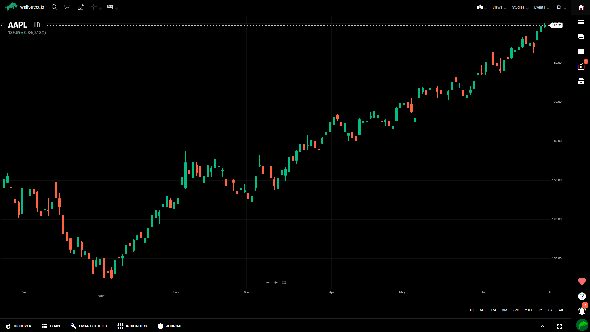
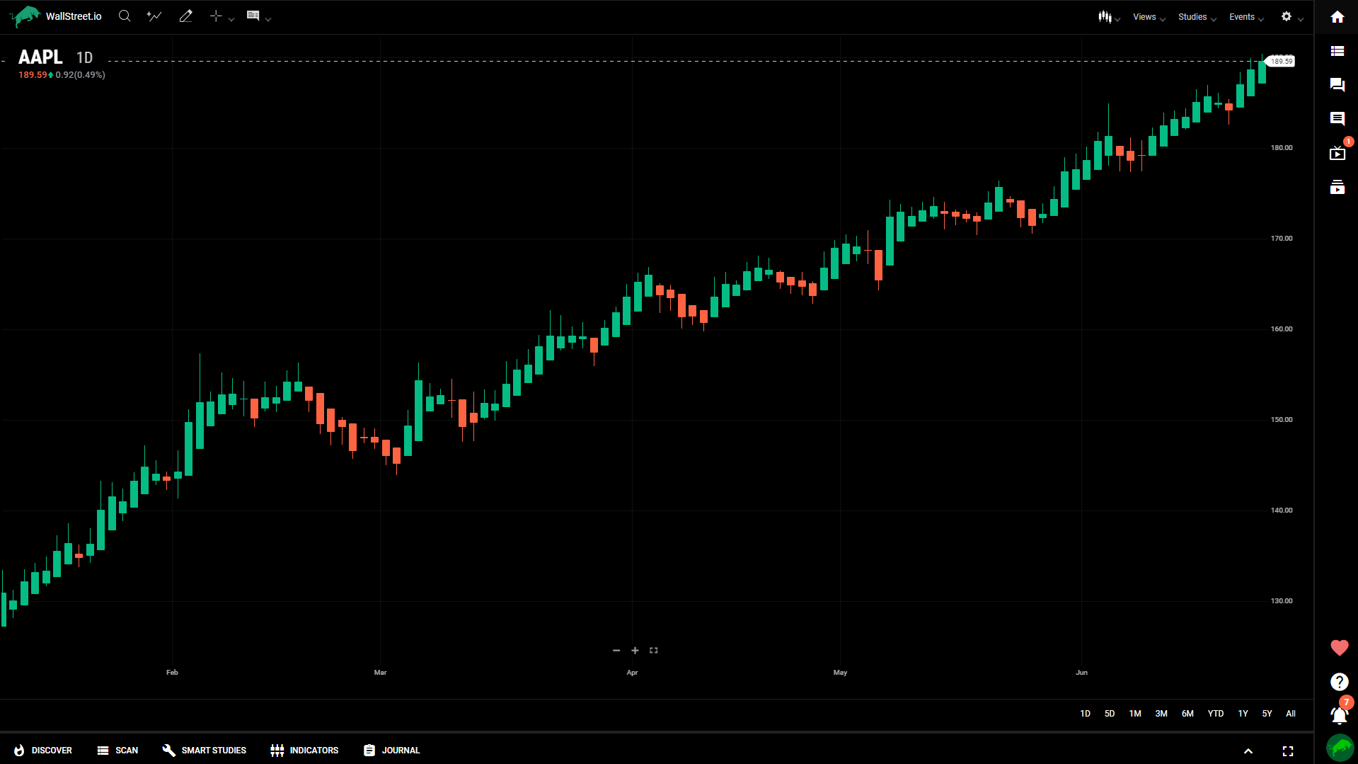
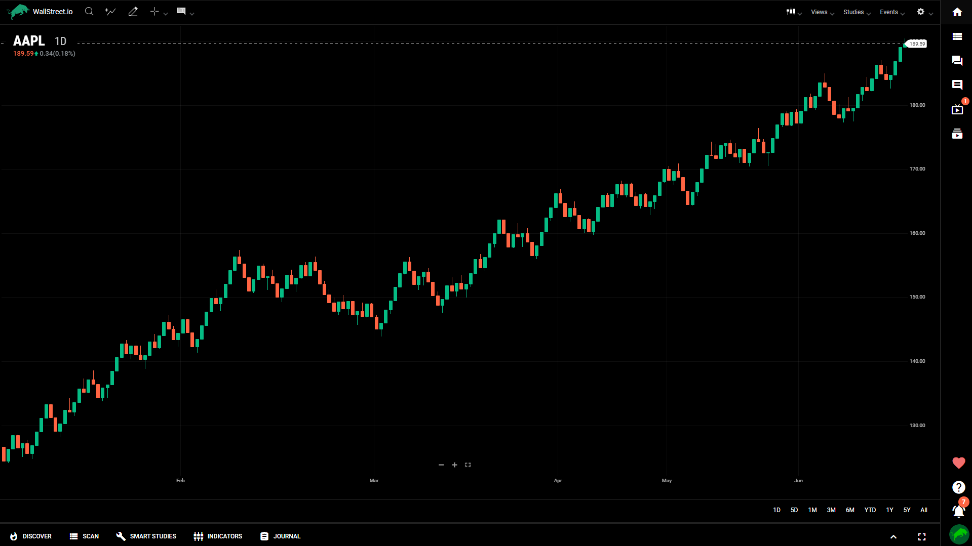
Candle
The candlestick chart displays price data as individual candlestick patterns, consisting of a body and wicks, representing the open, high, low, and close prices for a specific time period. It provides a visual representation of price action and helps identify trends and reversal patterns.
Bar
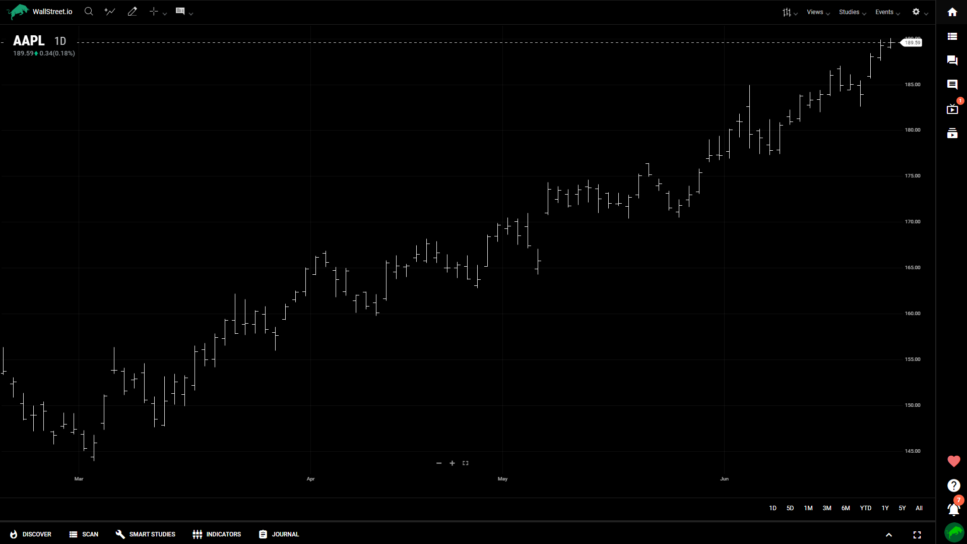
The bar chart represents price data using vertical lines with small horizontal lines on each side, indicating the open, high, low, and close prices. It provides similar information as the candlestick chart but in a simpler form.
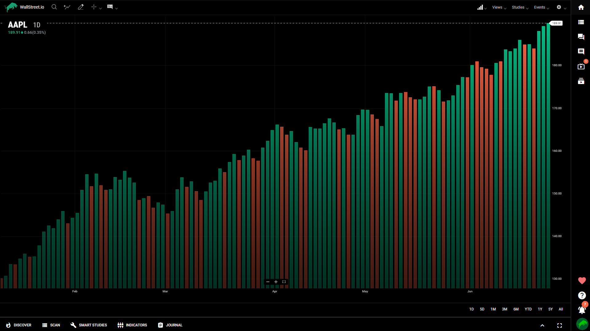
Colored Bar
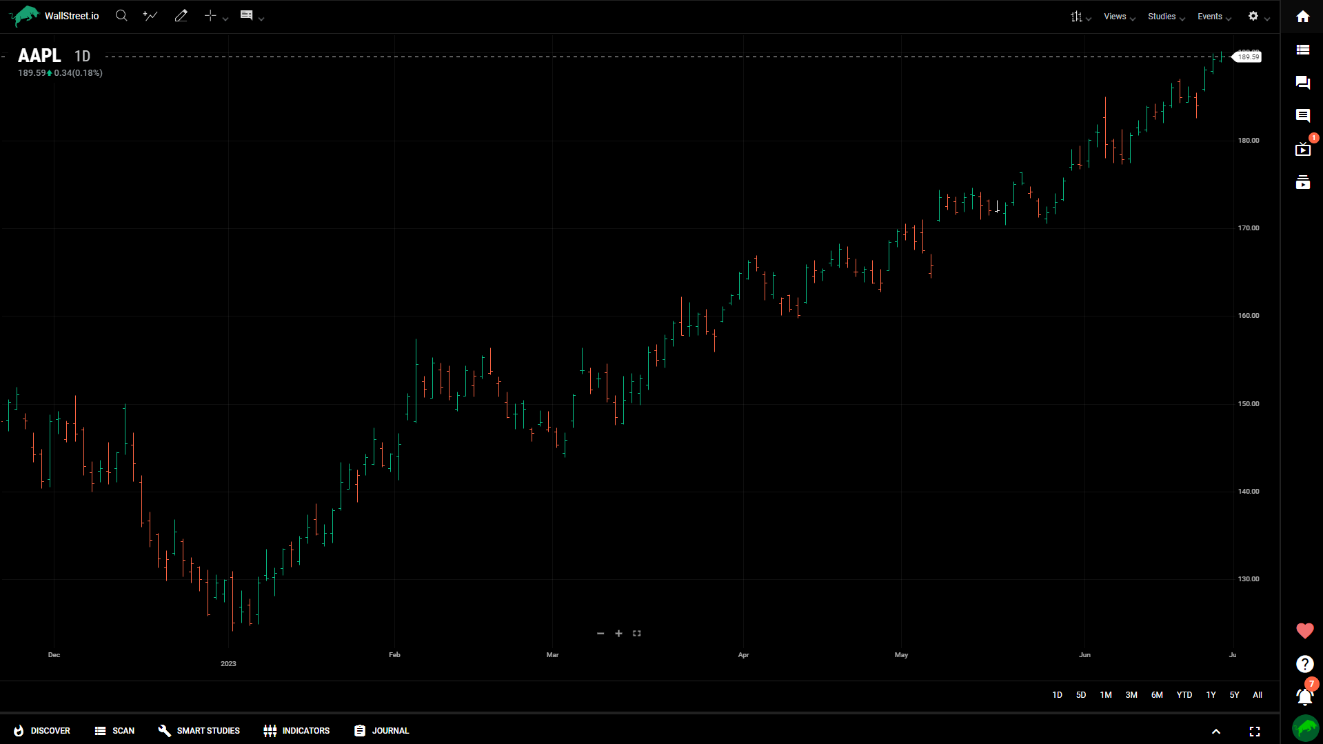
Similar to the bar chart, the colored bar chart uses color-coding to indicate price direction. Rising prices are typically represented with green bars, while falling prices are shown as red bars.
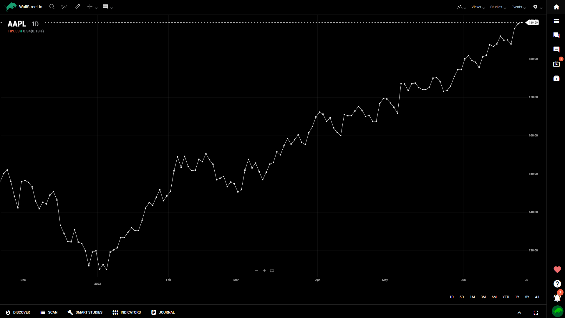
Line
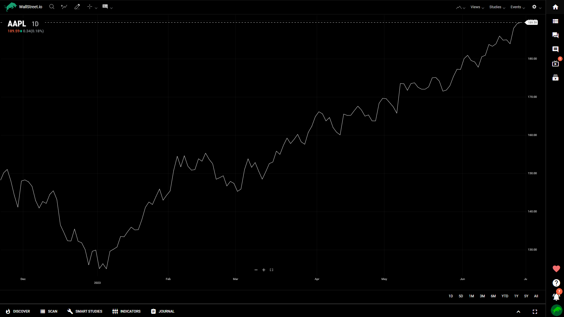
The line chart connects closing prices with a continuous line, offering a simplified view of price movements over time. It helps identify overall trends and visualizes the general direction of price changes.
Vertex Line
The vertex line chart is a variation of the line chart, representing price data using curved lines. It provides a smooth visualization of price trends and reduces noise from smaller price fluctuations.
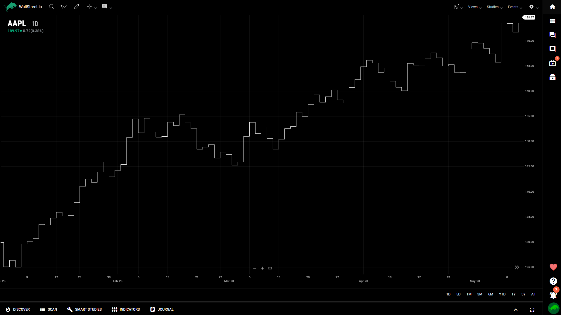
Step
The step chart displays price data using a series of horizontal and vertical lines, connecting the closing prices. It emphasizes changes in price levels rather than the continuous movement between data points.
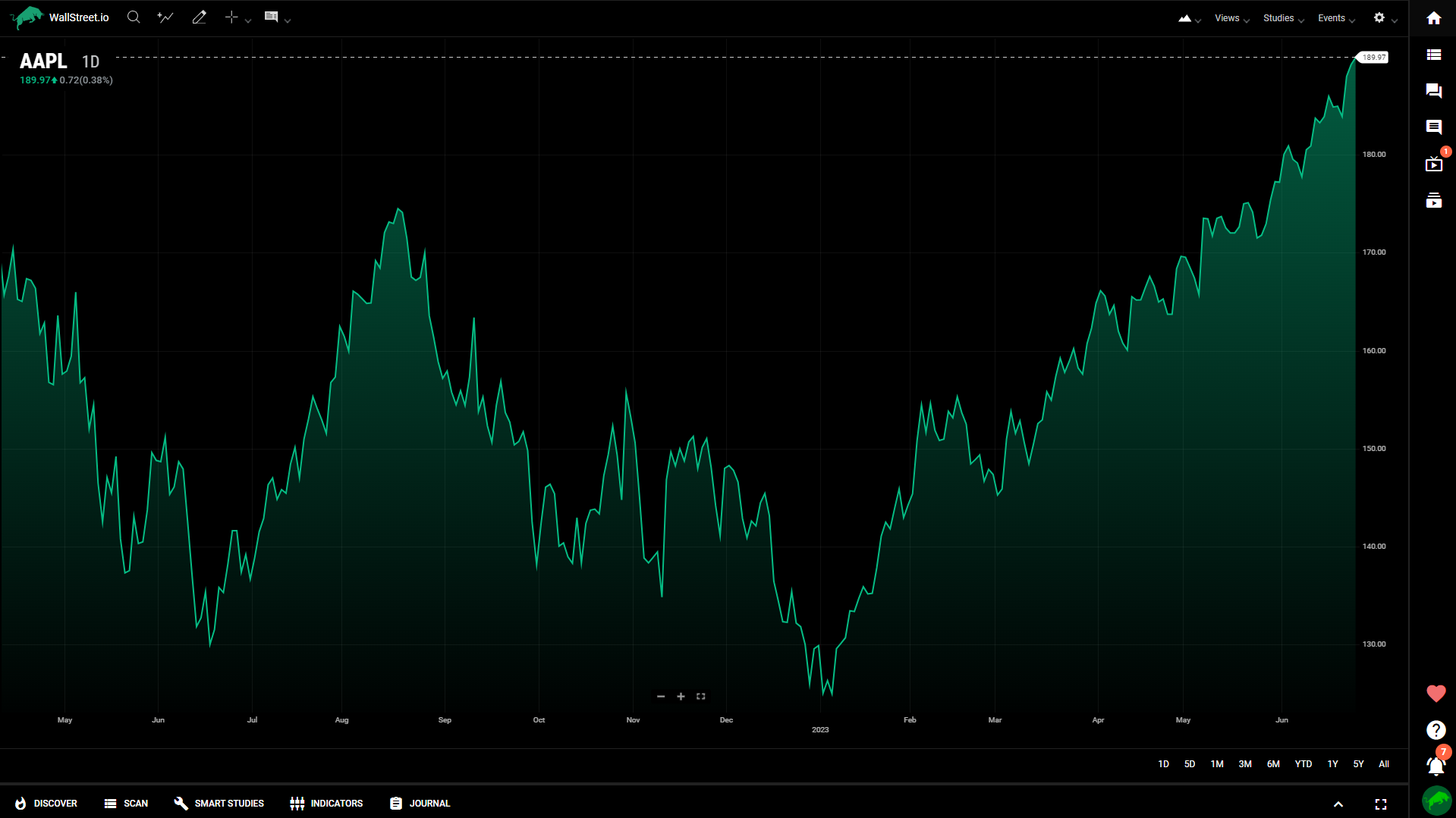
Mountain
The mountain chart displays price data as a filled area, with the height representing the price levels. It offers a visual representation of price distribution and helps identify areas of support and resistance.
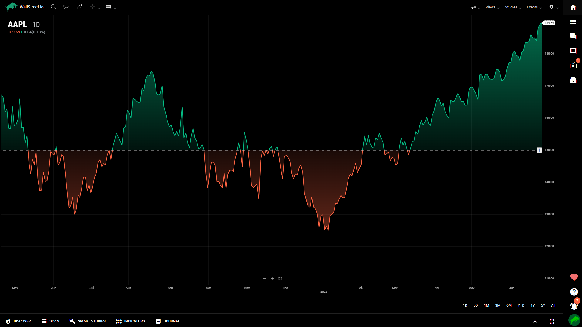
Baseline
The baseline chart shows the price movement relative to a baseline value. It helps identify price deviations from a reference point and is useful for comparative analysis.
Hollow Candle
The hollow candlestick chart is similar to the regular candlestick chart but represents rising prices with hollow bodies instead of filled bodies. It offers a clear visual distinction between bullish and bearish periods.
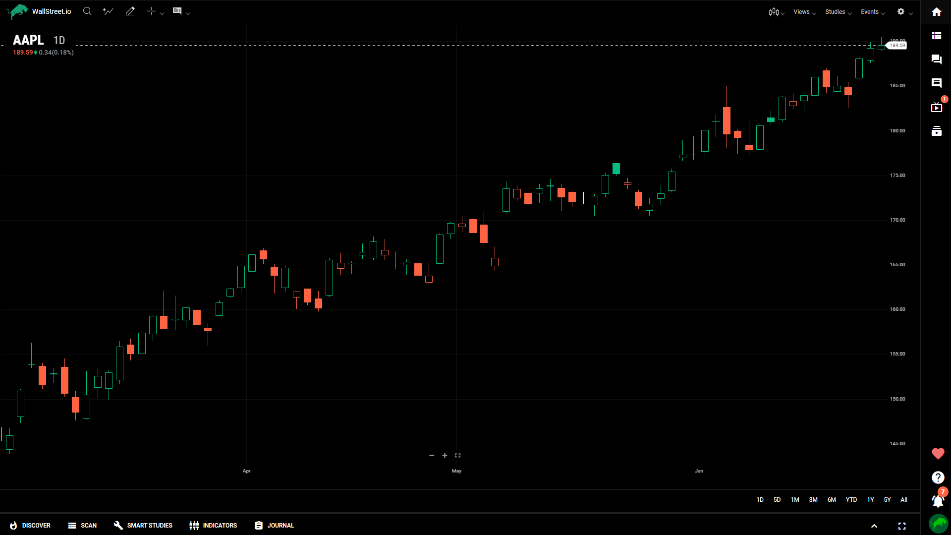
Volume Candle
The volume candle chart combines the candlestick chart with volume bars. It provides insights into both price and trading volume, allowing for analysis of price movements in relation to trading activity.
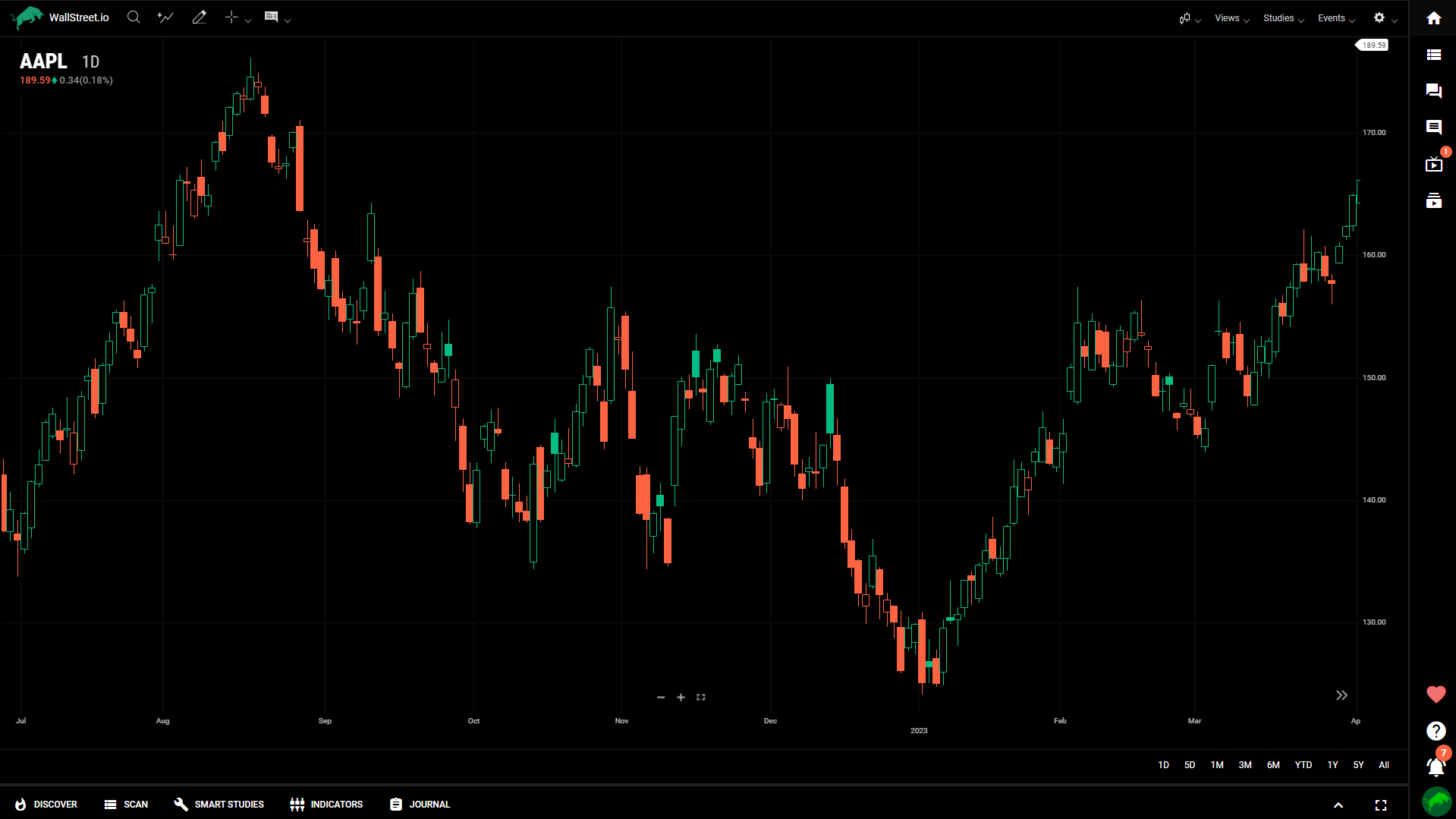
Colored HLC Bar
The colored HLC (High, Low, Close) bar chart represents price data using vertical bars with color-coded segments to indicate price direction. It offers a concise view of price action.
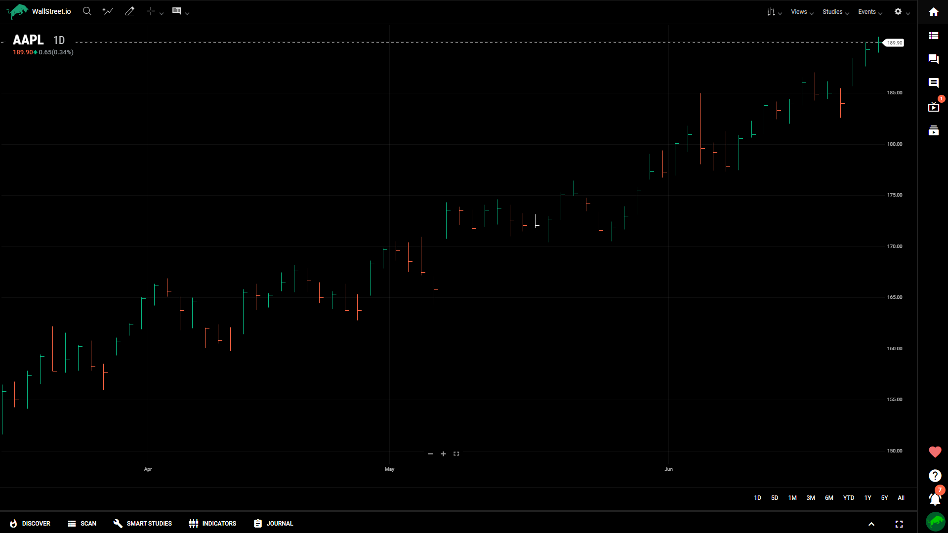
Scatterplot
The scatterplot chart displays data points as individual dots on a graph, allowing for the visualization of relationships or correlations between different variables.
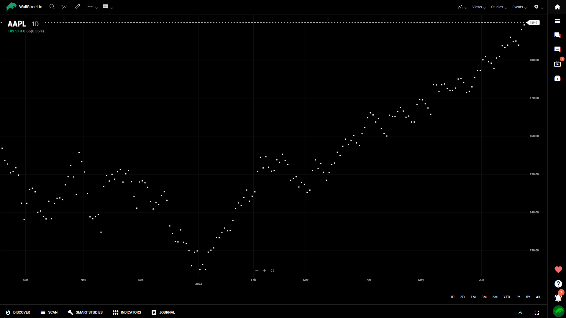
Histograms
The histogram chart represents data distribution using vertical bars of varying heights. It provides insights into the frequency or occurrence of specific data values within a range.
Aggregate Chart Types
This segment delves into a specialized group of chart types such as Heikin-Ashi, Renko, Kagi, among others, that reconfigure raw market data through aggregation and recalculation. These chart types offer a unique lens to market analysis, emphasizing specific market trends or smoothing out market noise, thereby providing a different perspective compared to the Normal Chart Types.
Aggregated Chart Types are particularly beneficial when you seek to uncover underlying patterns in the market, isolate price movements, or reduce the impact of volatility. By understanding and employing these charts, you can augment your analysis toolkit, enabling you to harness an added layer of complexity in interpreting market behavior.
Heikin-Ashi
Heikin-Ashi is a type of candlestick chart that uses a modified formula to calculate the open, high, low, and close values of each period.
It provides a smoother representation of price trends by averaging the values, making it easier to identify trends, reversals, and support/resistance levels.
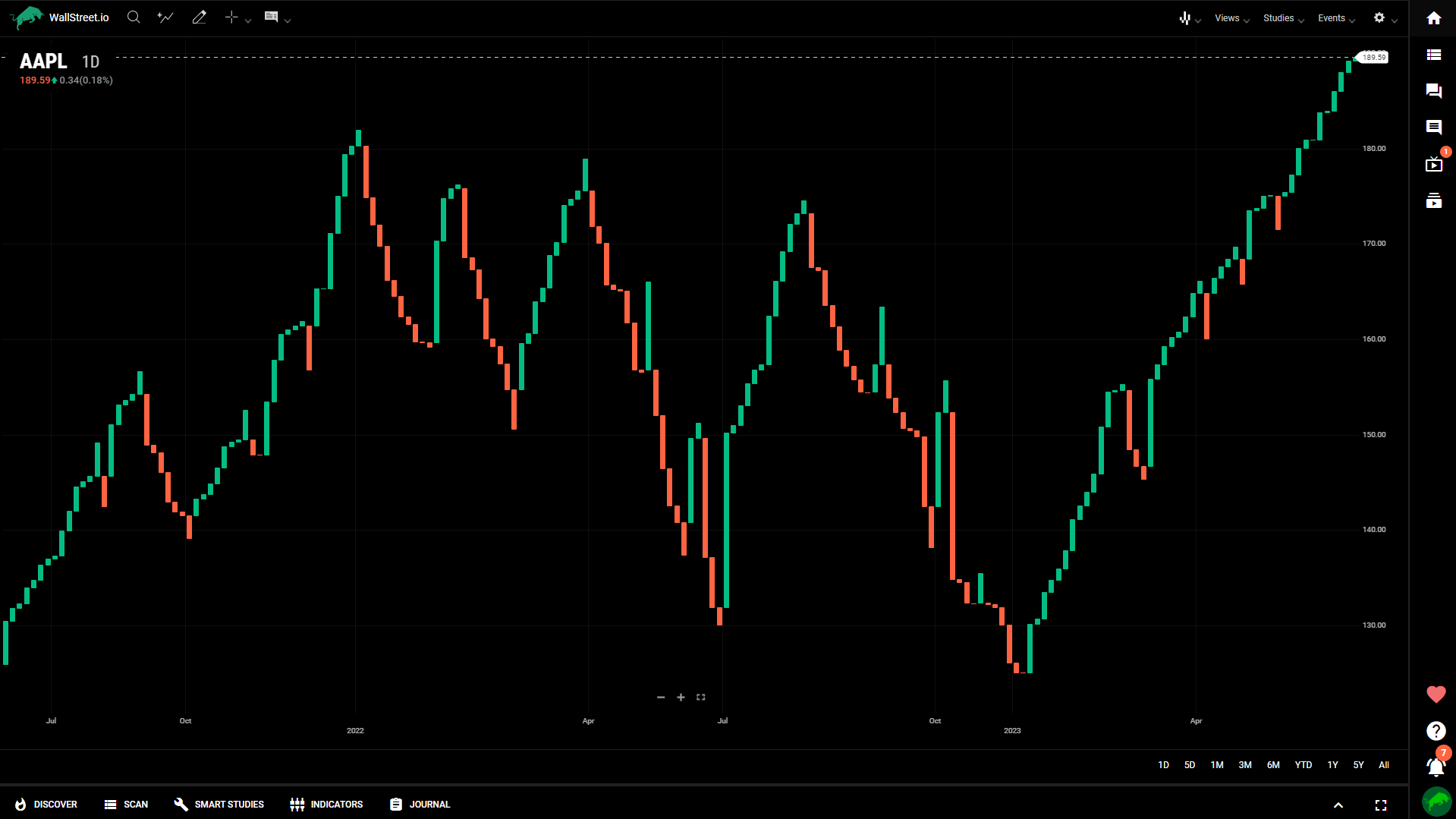
Kagi
Kagi charts focus on price movements and ignore time, creating a chart with vertical lines. The thickness and direction of the lines indicate the strength and direction of the price movement.
Kagi charts aim to filter out minor price fluctuations and focus on significant price reversals.

Line Break
Line Break charts represent price movements using lines that break in a specific direction, based on a predefined price threshold.
A new line is drawn only when the price exceeds the threshold, allowing for smoother trends and eliminating insignificant price movements.
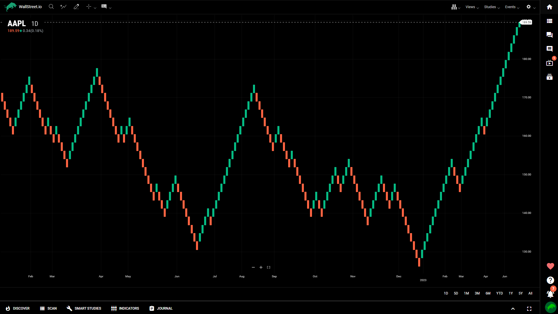
Renko
Renko charts display price movements using bricks, where each brick represents a fixed price increment. The bricks are not drawn unless the price surpasses the predefined increment, resulting in a cleaner chart that filters out noise.
Renko charts are useful for identifying trends and key support/resistance levels.
Range Bars
Range Bars represent price movements based on a fixed price range rather than time. Each bar has a specified range, and a new bar is created only when the price exceeds the range.
Range Bars help filter out noise and focus on price volatility, making them useful for identifying trends and reversals.
Point & Figure
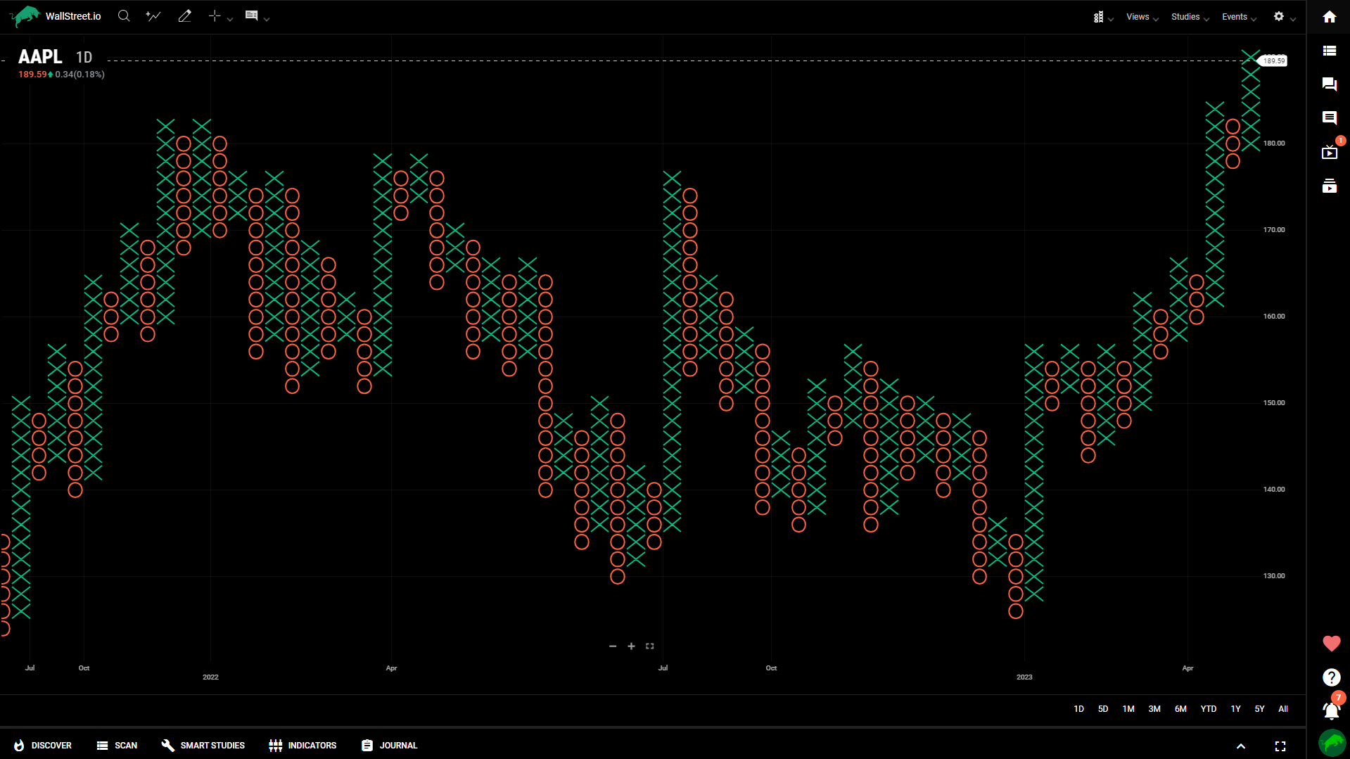
Point & Figure charts use X's and O's to represent price movements, with X indicating upward movements and O indicating downward movements. These charts focus on price changes rather than time intervals, filtering out minor fluctuations and emphasizing significant price movements.
Point & Figure charts help identify trends, support/resistance levels, and potential price targets.

 Discover Tab Reference Guide
 Discover Tab How-To Guide
 Smart Studies How-To Guide
 Smart Studies Reference Guide
 Scan Tab Reference Guide
 Scan Tab How-To Guide
 Watchlists How-To guide
 Watchlists Reference Guide
 Chatrooms Reference Guide
 Community Wall How-To Guide
 Community Wall Reference Guide
 Streams Reference Guide
 Streams How-To Guide