
Chart Types How-To Guide
We know that the financial markets can often seem like a labyrinth, filled with countless data points and complex financial instruments. In this maze, charts stand out as indispensable tools to simplify the analysis and comprehension of market dynamics. At Wallstreet.io, we believe in empowering our users with knowledge and practical insights, and this guide is designed to do just that.
From the classic Candlestick Charts to Heikin-Ashi and many others, this guide covers a wide range of chart types to help you understand and leverage the different visual representations of price action. Each chart type offers a unique perspective, revealing distinct aspects of market behavior.
Let's dive into some expert tips on how to leverage the unique features and benefits of Chart type.
Regular Chart types
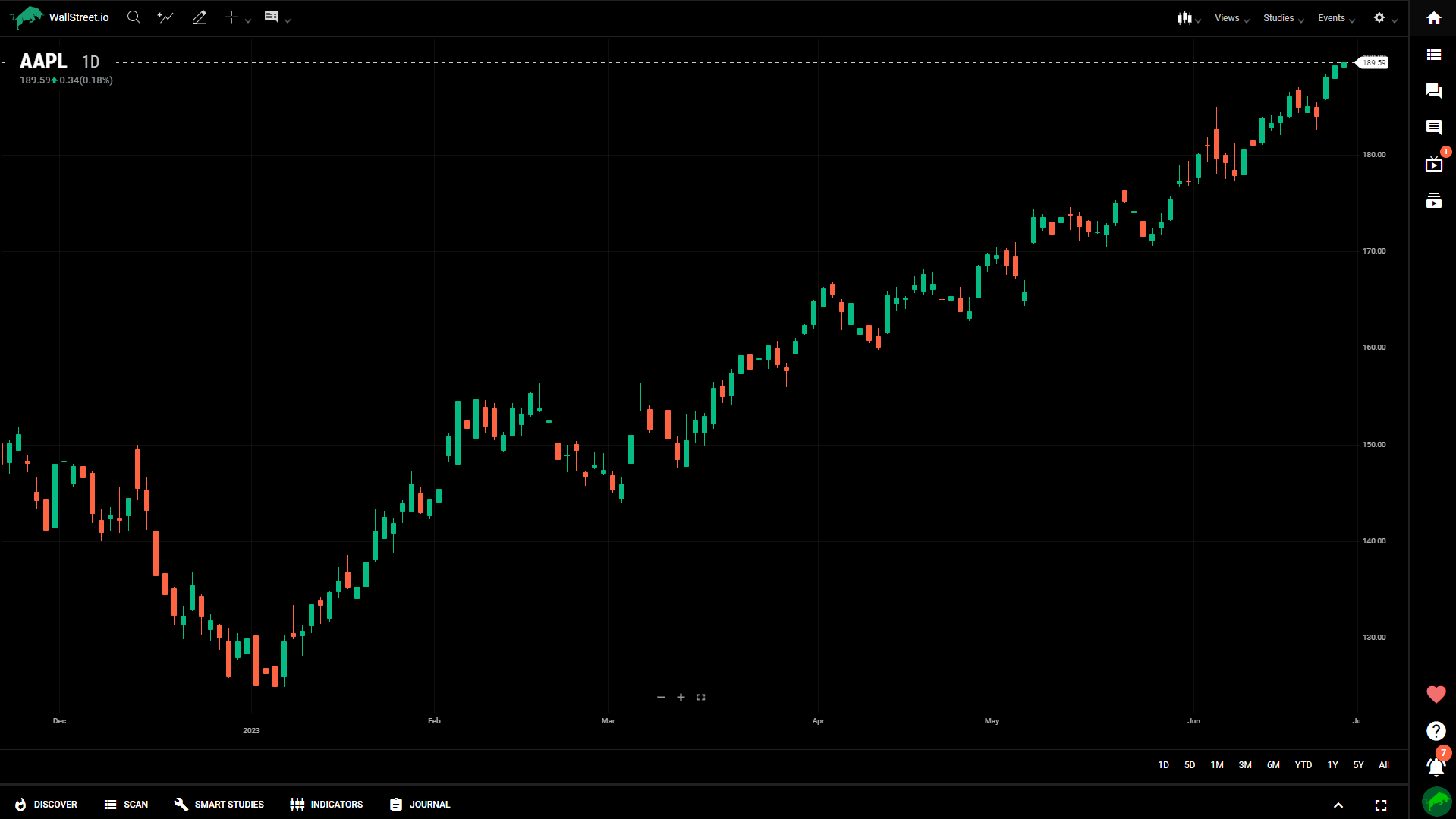
Candle
Like bar charts, candle charts represent OHLC, except in the form of colored rectangles called candles. The candle is shaded green when the open is lower than the close. When the open is higher than the close, the candle is shaded red. If the open and close are the same, a thin horizontal line segment is drawn at that price (this type of candle is called a “doji”). Each candle has a “wick” that extends above and below the candle to indicate the high and low, respectively.
How to use the Candle charts:
Candlestick charts are widely used and versatile. They provide valuable information about market sentiment, trend direction, and potential price reversals.
Bar
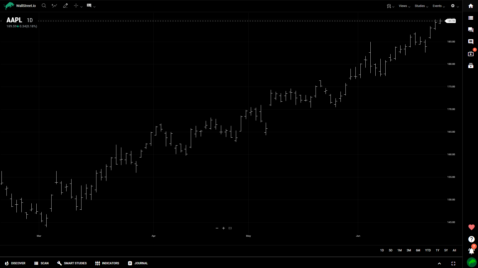
Bar charts consist of vertical lines sandwiched between two shelves. One bar is created for each interval (period) on the chart. Each bar represents the OHLC (open, high, low, close) for the period. The top and bottom of the vertical line represent the high and low for the period. The left shelf is the opening price while the right shelf is the closing price. The bars are a single color.
How to use the Bar charts
Bar charts are also widely used for technical analysis due to their simplicity and effectiveness.
Colored bar
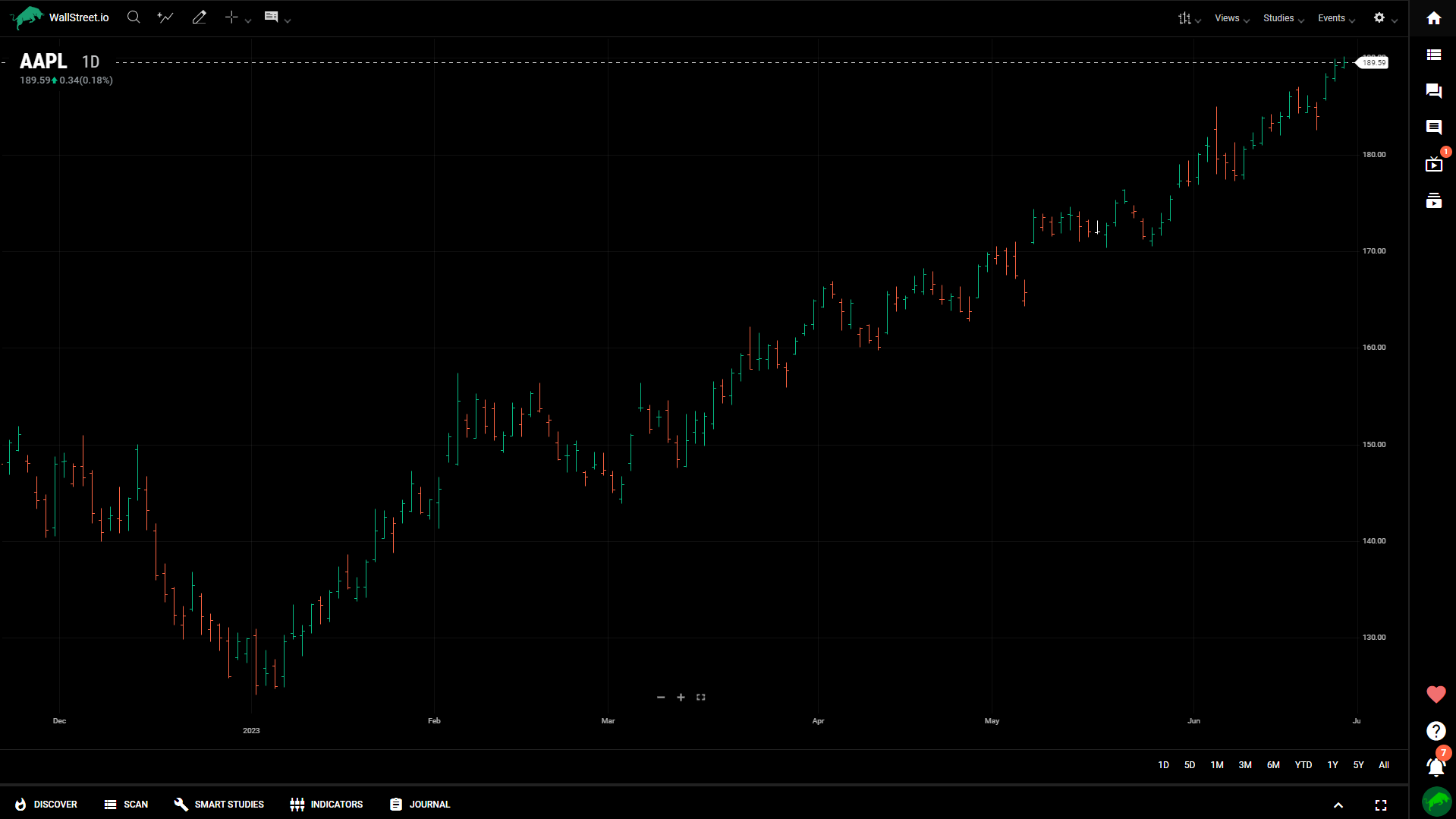
The Colored Bar chart draws a bar chart with the bars colored to indicate price action. The algorithm is the same as the Bar chart.
Line
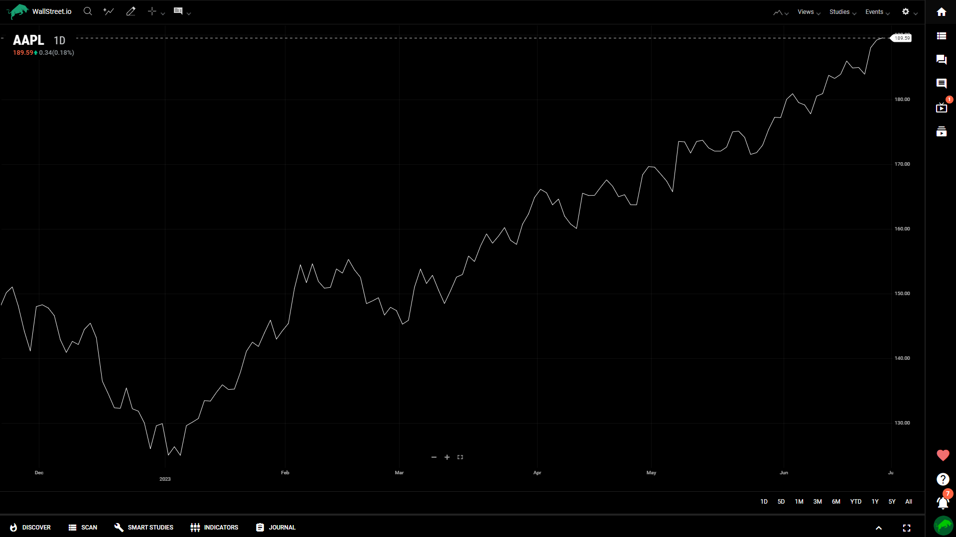
A line chart consists of segments that connect at the close price for each time period. The line is a single color. Any value in the price data that has a null value for close will result in a gap within the line.
How to use the Line charts
Line charts are simple yet effective tools for identifying price trends and key levels.
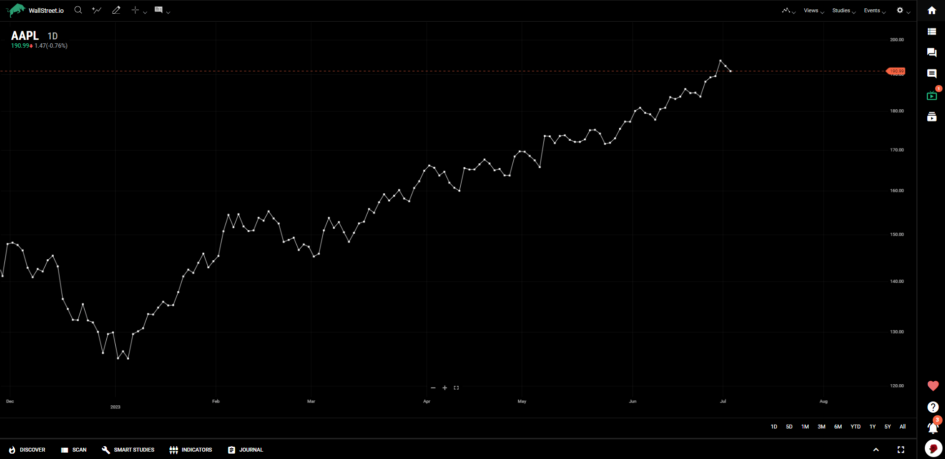
Vertex Line
The Vertex Line chart is composed of Scatterplot points connected with a Line Chart.
Step
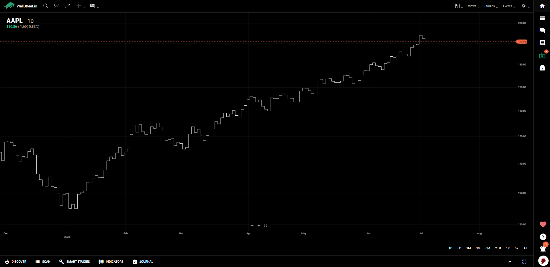
A Step chart is a line chart in which points are connected by horizontal and vertical line segments, looking like steps of a staircase.
Step line charts are used when it is necessary to highlight the irregularity of changes: for example, when changes in tax rates or interest rates are visualized. While the line chart emphasizes the trend in data over time, the step line chart draws attention from the trend to show periods with no change and emphasize the exact time of each change as well as its magnitude.
How to use the Step charts
Step charts can be useful for identifying price trends and potential support/resistance levels.
Mountain
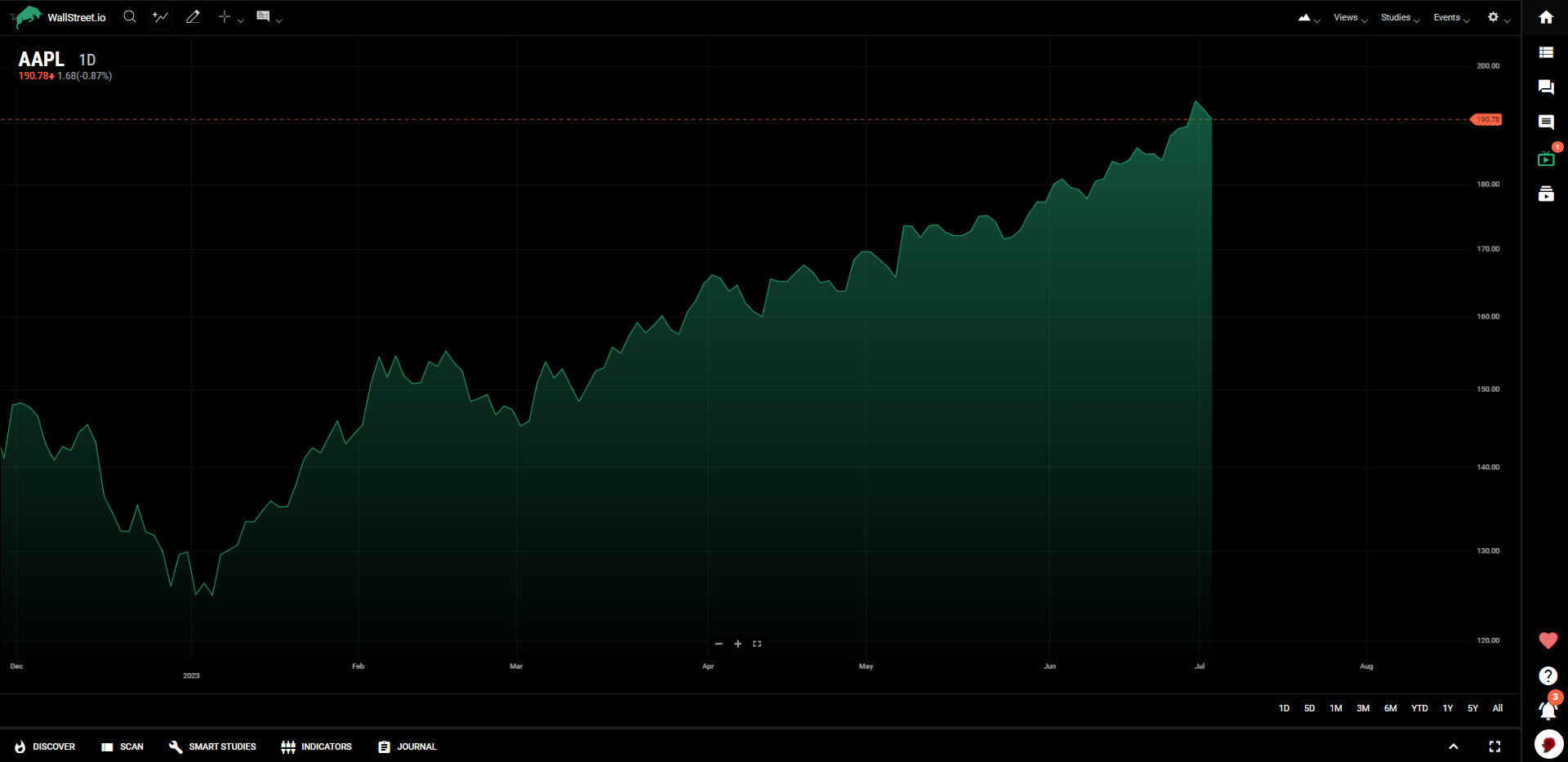
Mountain charts (sometimes called area charts) are Line charts with a shaded section that extends to the bottom of the chart. The result is a chart that looks like a mountain.
Baseline
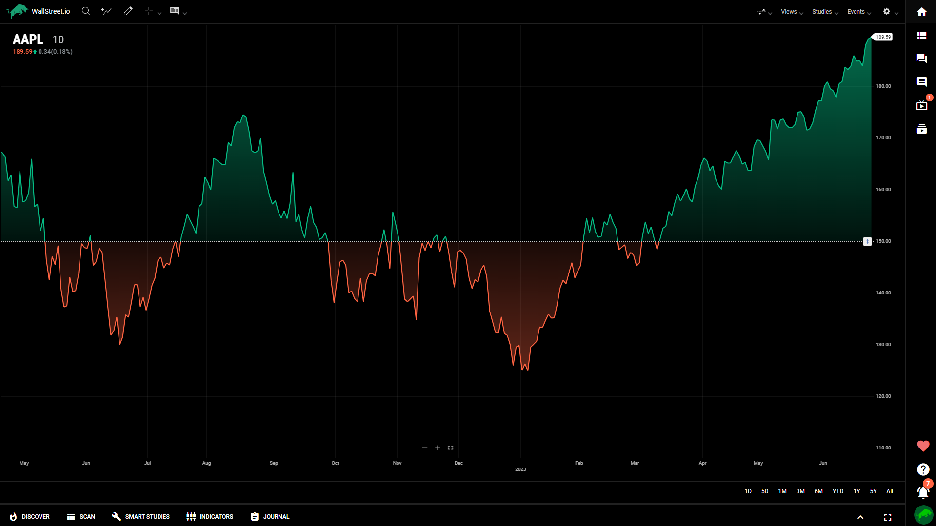
A baseline chart draws a Line chart that oscillates across a dotted baseline. The area above the baseline is shaded green, and the area below the baseline is shaded red. The baseline initializes to the leftmost closing value on the chart but can be adjusted by dragging the handle located on the right side of the chart. This chart style is meant to highlight the positive and negative distance from the set baseline.
It is typically used for intraday charts where the left side (baseline) is set to the opening of the market day.
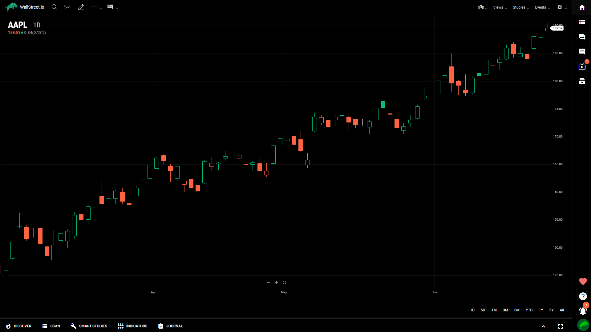
Hollow candle
Hollow candle charts are a special type of candle chart that displays additional information and changes the meaning of the colors. In a hollow candle chart, a green candle occurs when the closing price is higher than the prior bar’s closing price. It is red when the closing price is lower than the prior bar’s closing price.
The candles are either filled or hollow based on the price action within the candle. Hollow candles are drawn when the close is higher than the open (upward intra-session price action). The candle is filled when the close is lower than the open (downward intra-session price action). If the close is the same as the open, only a gray horizontal line is drawn.
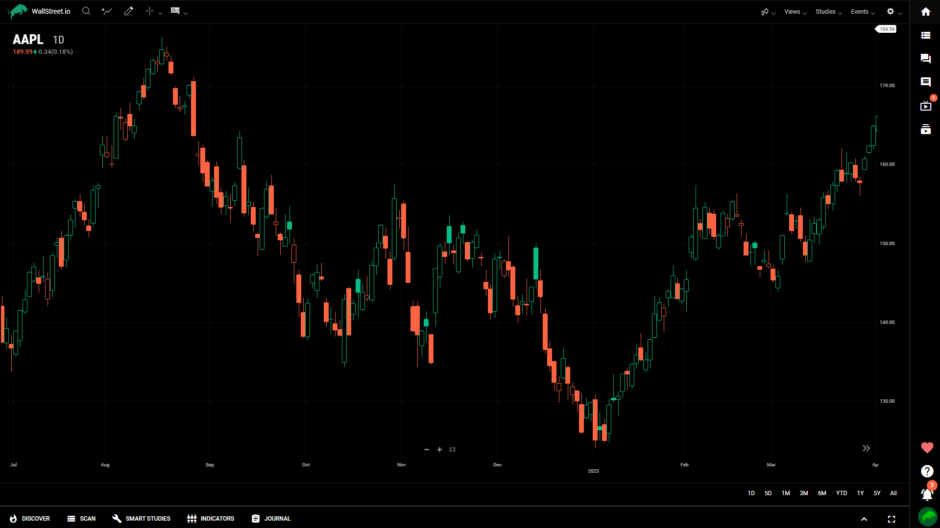
Volume candle
A volume candle chart is a hollow candle chart where the width of a candle varies to indicate volume. Each candle’s shading and fill follow the same conventions as those in hollow candle charts. Wide candles indicate high volume while narrow candles indicate low volume.
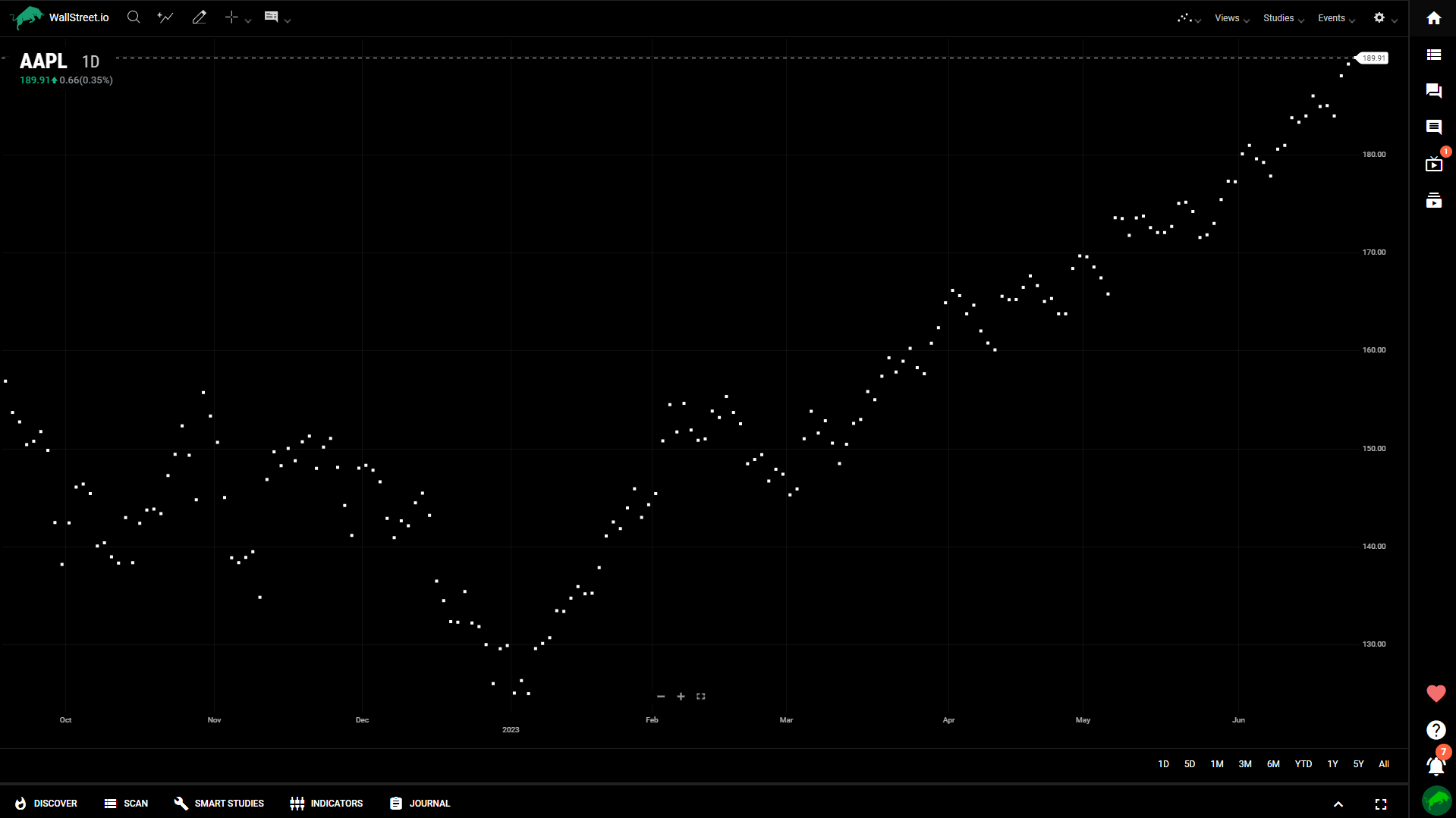
Scatterplot
The Scatterplot chart draws a single dot at every closing value for each time period and does not connect them. It is often used to visualize the relationship between two variables or data points.
Each dot on the chart represents a specific data point, typically displaying the relationship between an independent variable (x-axis) and a dependent variable (y-axis).
Scatterplot charts are useful for identifying correlations, patterns, or outliers in the data.
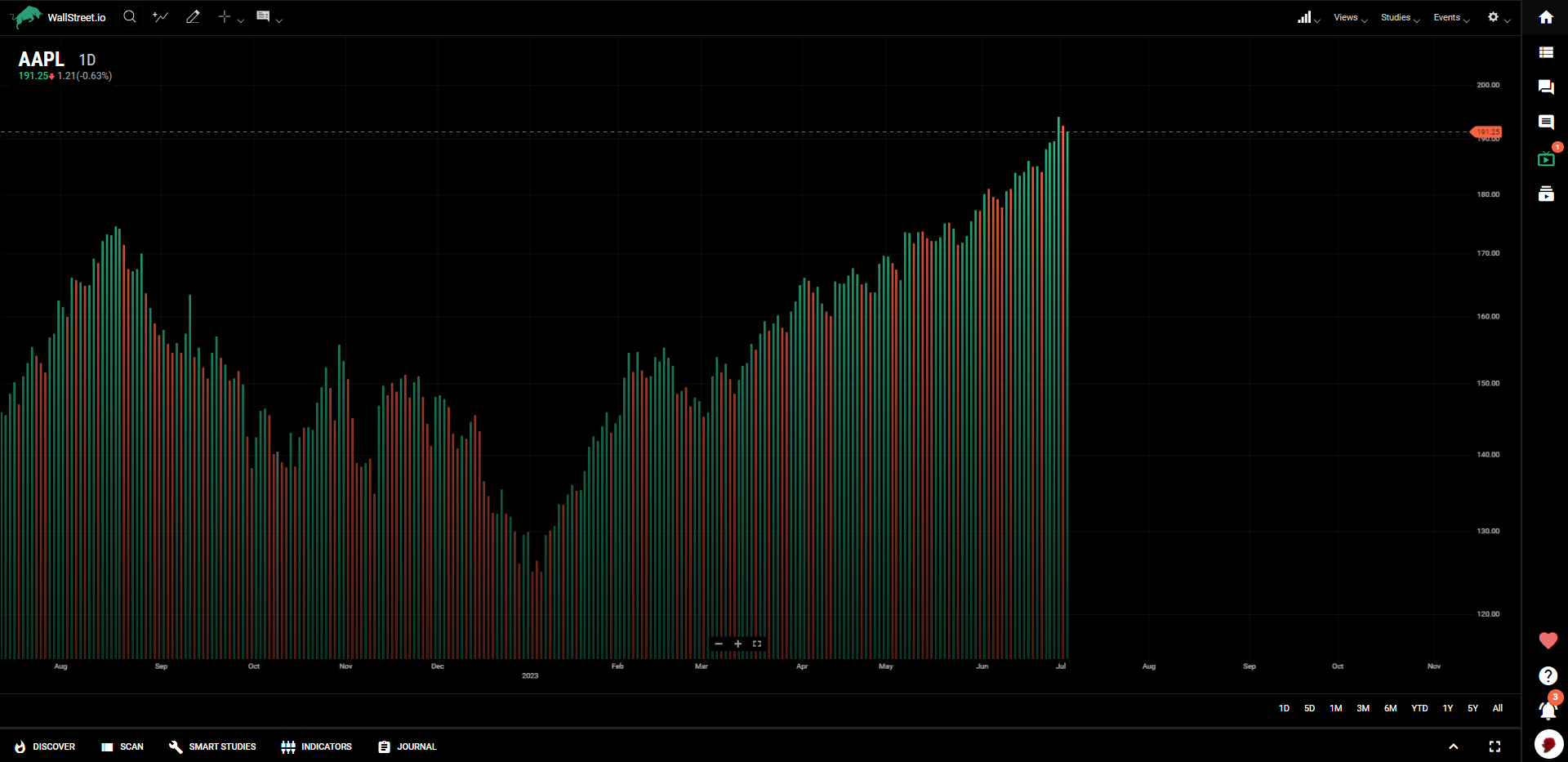
Histogram
The Histogram chart represents price action with bars from the bottom up, and looks pretty similar to the Volume indicator.
Aggregated Chart types
Heikin Ashi
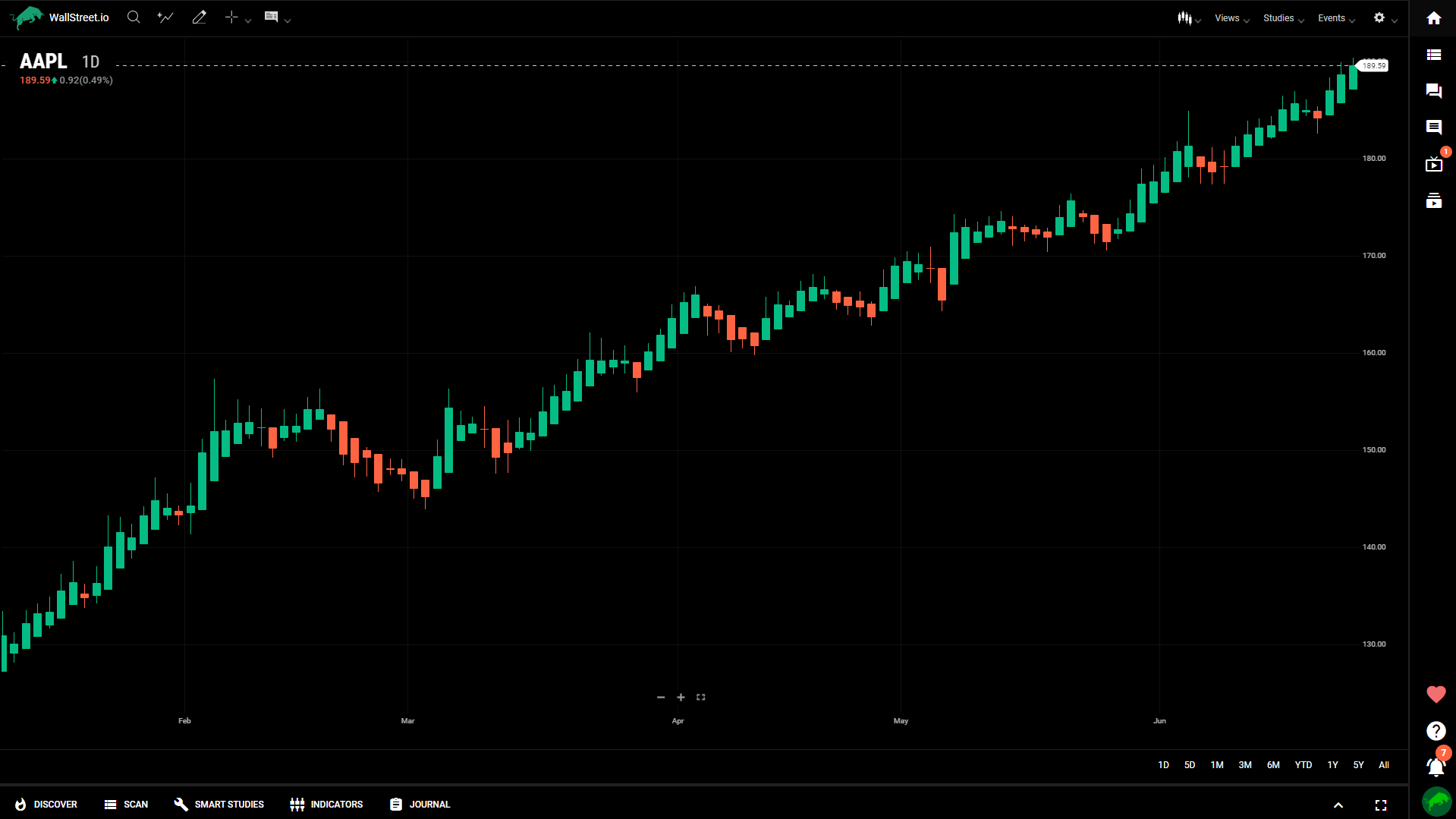
Heikin Ashi charts are time series charts that resemble candle charts. In a normal candle chart, each candle is calculated independent of the other candles. However, in Heikin-Ashi charts, the candles appear to link together because of how their OHLC values are calculated:
● Open = the mean of the previous open and the previous close
● High = the maximum of the current high, open, and close
● Low = the minimum of the current low, open, and close
● Close = the mean of the current open, close, high, and low
Upward trends are indicated by green candles with wicks on top, but almost no wick on bottom. Downward trends are indicated by red candles with wicks on the bottom and almost no wick on top. Reversal points are indicated by candles, red or green, with small bodies and wicks on top and bottom. This chart type can spot trends more clearly and easily than regular candle charts.
Kagi
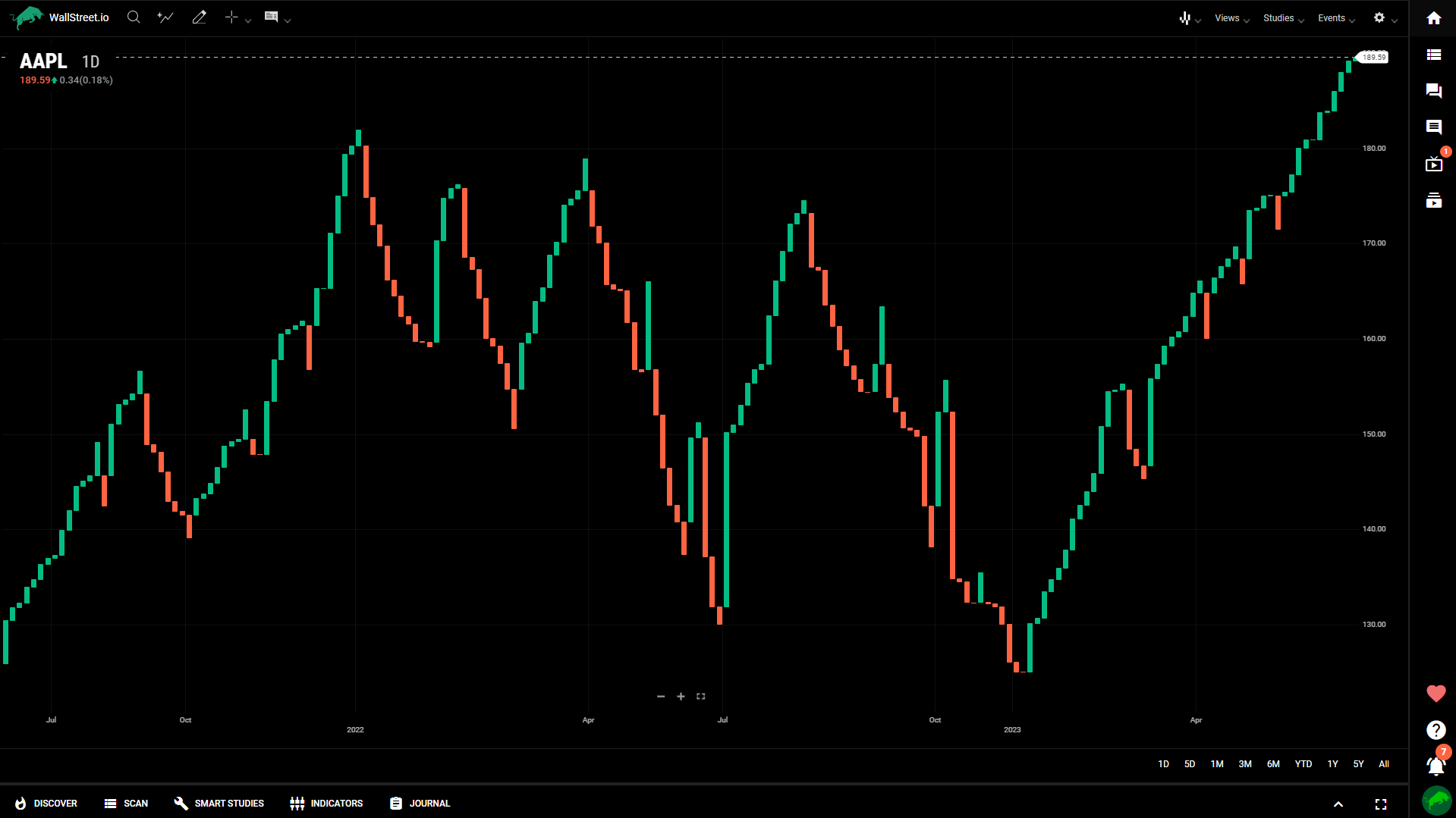
Kagi charts appear as vertical bars connected by small horizontal segments at right angles. They are independent of time and progress forward based on price action.

Line break
Line break charts appear as vertical bars that ascend and descend. These charts are time independent and are determined only by price action. Ascending bars are colored green and indicate upward price action. Descending bars are colored red and indicate downward price action.
Line break charts are constructed by looking at the close of a bar and comparing it to a previous bar’s close; which bar it is compared to is determined by you. If the current bar’s close is higher than the one it is being compared to, a green ascending bar is drawn. If the current bar’s close is lower than the one that it is being compared to, a red descending bar is drawn. If the current close is the same, or if the price does not move enough in one direction or the other to signify a reversal, then no bar is drawn.
Line break charts default to a value of three, meaning that it compares the current bar’s close to the bar that came two periods earlier.
Renko
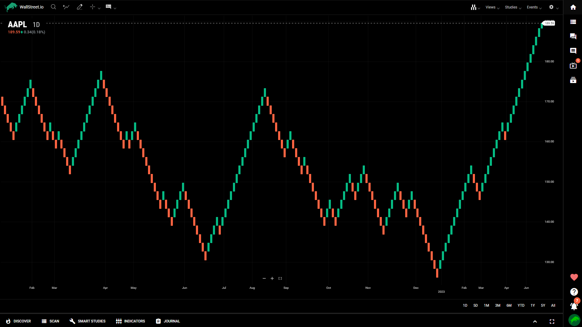
Renko charts appear as a series of equally sized blocks stepping diagonally upward or downward. This chart type, developed by the Japanese, measures price movement independent of time. The objective is to clearly see the market’s directional movement, persistence, and magnitude. Renko charts are constructed from a series of bricks placed sequentially upward using green blocks or downward based on user-defined fluctuations in price. The user can set the Brick Size using the Set Range property. Once price moves more than the user-defined range, a new brick is added to the chart in the corresponding direction.
How to use the Renko charts:
Range bars
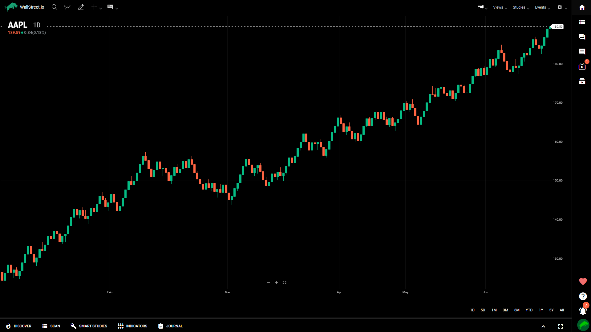
Range bar charts appear as a series of equally sized candles. A new bar is formed when the price moves outside of a given defined range, which is configured by you in Set Range.
Point and figure
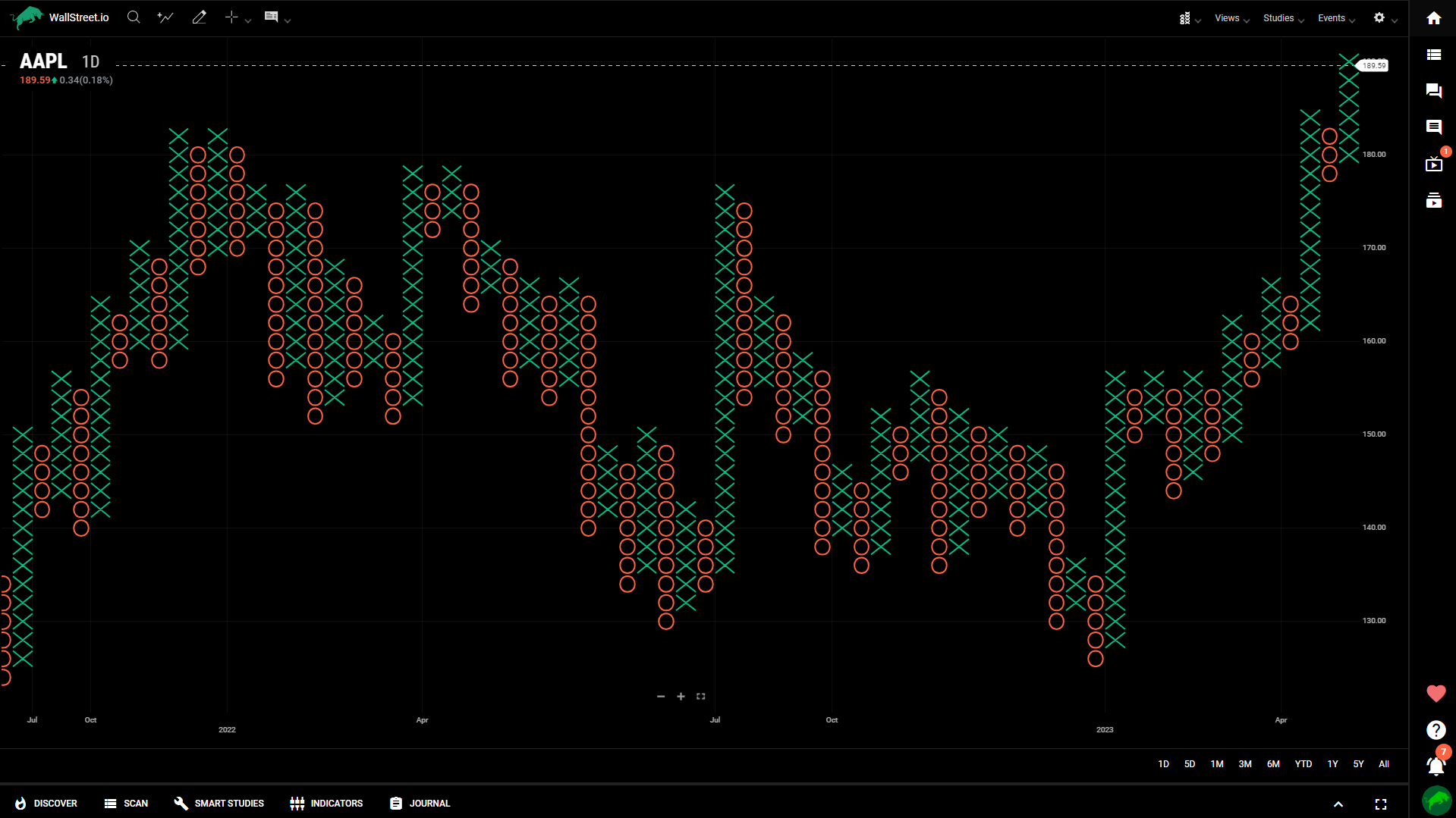
Point and figure charts display an X for upward price action and an O for downward price movement. The X and O represent a specific price increment, known as the box size which is configured in properties by you. The objective is to capture directional price trends without the impact of time. A new column is formed when price reverses a set number of boxes, that is a multiple of the box size. The reversal value is configured in properties by you.
Closing thoughts
Understanding various chart types is essential for conducting effective technical analysis on our platform. Each chart type offers unique features and insights into price movements, trends, support and resistance levels, and potential trading opportunities.
By following the step-by-step guides provided, beginners can gain confidence in using these chart types to analyze market data. It’s crucial to consider factors such as time frames, price increments, reversal limits, and customization options to tailor the charts to individual trading styles and goals.
While the guide has provided a solid foundation, it is important to continue learning and practicing with real-time market data to enhance chart reading skills and refine analysis techniques. Combining chart analysis with other technical indicators, risk management strategies, and market knowledge will further strengthen the decision-making process.
Ultimately, choosing the most suitable chart type depends on your preferences, trading style, and the specific market being analyzed. By incorporating these chart types into your technical analysis toolkit, you'll be better equipped to navigate the complexities of the financial markets. Remember, practice and continuous learning are key to mastering the art of chart analysis!

 Discover Tab Reference Guide
 Discover Tab How-To Guide
 Smart Studies How-To Guide
 Smart Studies Reference Guide
 Scan Tab Reference Guide
 Scan Tab How-To Guide
 Watchlists How-To guide
 Watchlists Reference Guide
 Chatrooms Reference Guide
 Community Wall How-To Guide
 Community Wall Reference Guide
 Streams Reference Guide
 Streams How-To Guide